CSS Grid Builder
Learn, prototype, create, get ready!

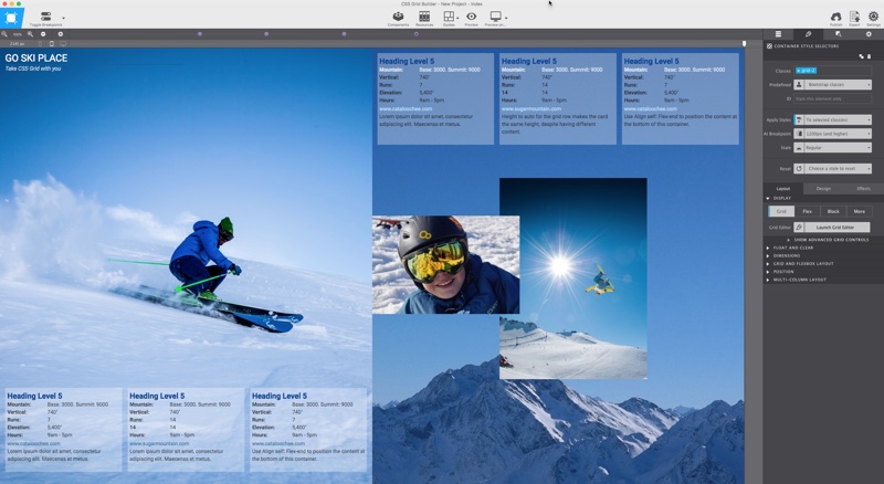
Get your grids going today with this free app.
Lorem ipsum dolor sit amet, consectetur adipiscing elit. Maecenas et metus.
Learn, prototype, create, get ready!


Lorem ipsum dolor sit amet, consectetur adipiscing elit. Maecenas et metus.
The CSS Grid ain't real... That is to say, there is nothing there to see, no structure, no lines, no cells, nothing.
At the very minimum the previously used grid systems consisted of visible HTML code — cells (columns) where HTML elements would be placed in. Therefore these constructs could also easily be made visible with borders or an overlay. With CSS Grid there is no HTML part to the grid — there is nothing to see. The grid only becomes apparent when content (elements) are added and positioned according to the grid rules.
Compare it to a boat at sea going to the exact right place using a GPS system. The sea looks the same everywhere, but some outside system 'guides' the boat to where it needs to be. To help create these systems we created a Grid Editor. Each container can act as a grid system and also contain other containers with grids. It offers visible help for setting up the structure, and changing it at breakpoints where needed.
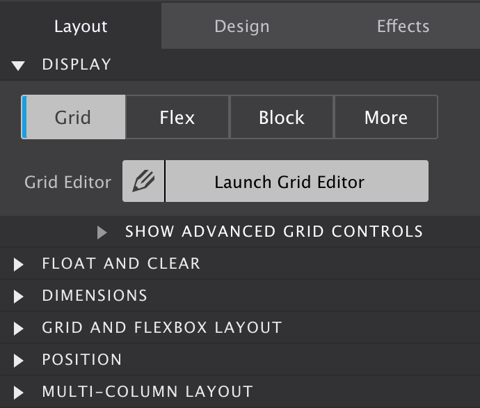
To start toying with the grid, simply click on the Display toggle and set it to Grid. This works on all container elements, from a plain ol' <div> to an important <nav>. Then, launch Grid Editor — showcased in the big screenshot below this section — to visually configure the desired grid setup. Finally, each element (the boat at sea) can be told to go to a specific location. Or you can do nothing and watch the automatic placement algorithm pop the grid elements in position.
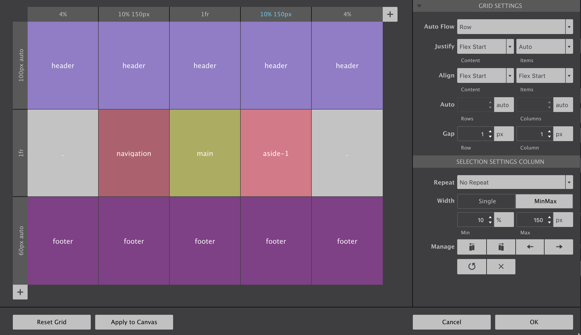
Grid columns and rows — grid tracks — are added using the respective + buttons. To configure row or column settings, simply click on the grey header. Then widths and heights can be specified using the input and unit chooser which includes the new awesome fr unit. A single value or MinMax values (really handy!) can be selected with the height (rows) or width (columns) toggle.
There are also manage controls that make it easy to duplicate rows and columns or move them into different positions. If you have a large screen and hit the Apply to Canvas button on the low left, you will see all elements in the grid container reposition accordingly.
This can be influenced through the controls in the Grid Settings section. By default grid-items are automatically filling the cells on a row by row basis. This auto placement algorithm can be influenced with the Auto Flow property available through the corresponding dropdown in this section. Some explanation on how the dense keyword works will be added to the Grid Guide soon.
The Justify and Align properties work very similar to how flexbox aligns items. They determine where the items are placed in a grid area along the column (block) and row (inline) axis.
Rows and columns that are automatically created normally grow and shrink to accommodate the content they hold. Using the Auto controls a default size can be specified for that situation.
Gutters can be specified with the Gap controls. If you are like me and have tried to do this in Flexbox layouts you will just love the way it works here!
Grid cells can be named. When adjacent cells have the same name grid areas are created. Items can be placed by simply specifying what area they belong to. A very semantic and convenient way of managing a layout!
Click on a cell to opens up a text input. The name can be entered directly in the cell or in the corresponding control area on the right (see below).
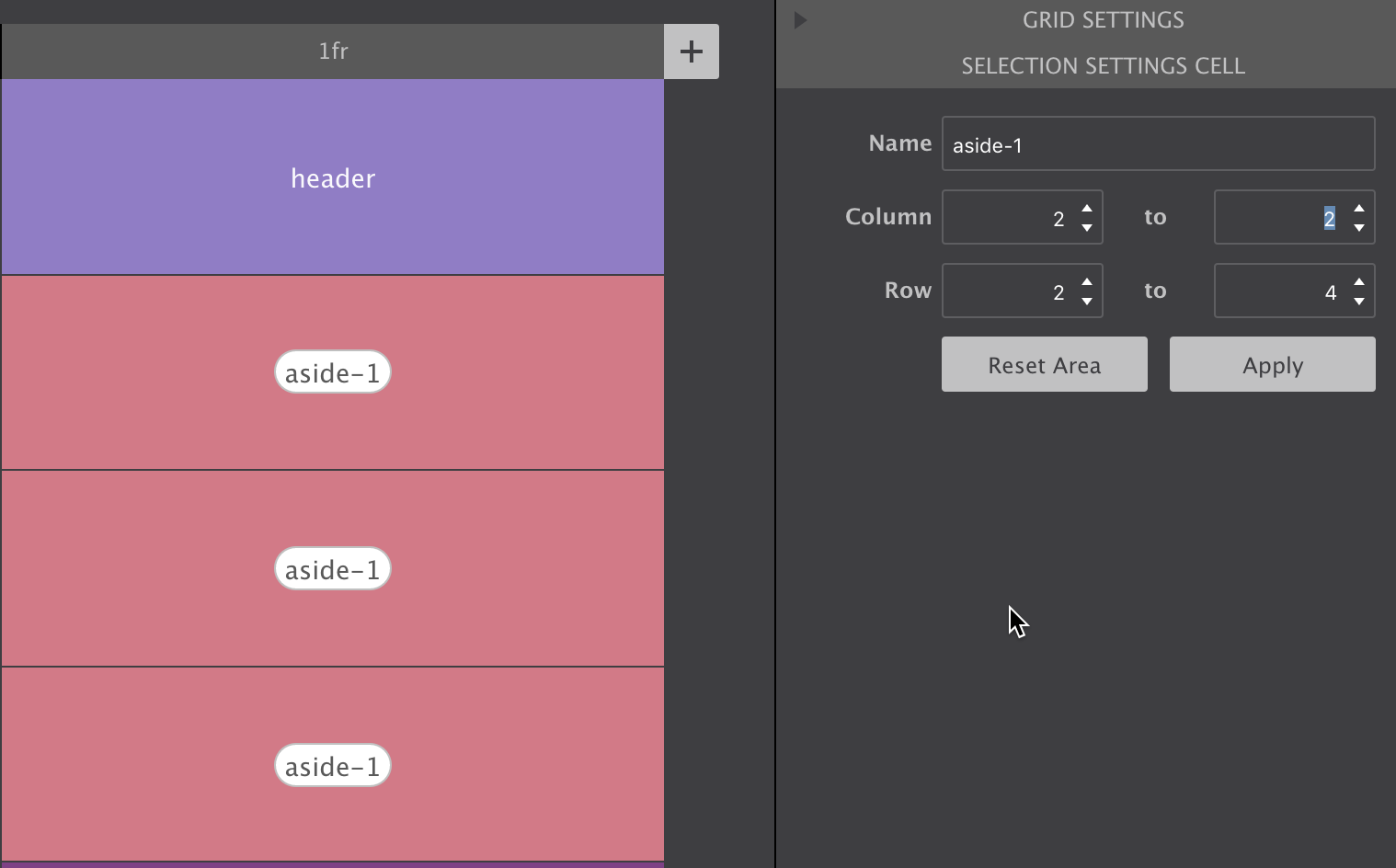
Using the control pane you can also specify how far an area needs to stretch, what column or row it starts and where it ends. Just don't forget to hit the Apply button when you’re done.
To place an item in an area, just select the element and enter the area name in the Grid and Flexbox Layout section on the Styles pane.
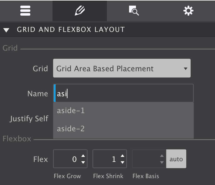
And if you are just like me and suffering from a bad memory when designing, the auto-suggest is a great help!
The video below gives a quick impression of the CSS Grid Builder. And for those interested, we listed some reasons why we made this (free) app below it.
Powerful, hot, flexible all apply this layout method of the future. But, powerful new technologies often come with a bit of a learning curve. The same is true for CSS Grid. And the fact that the grid configuration is not easily visible, does not help!
The visual grid editor (see previous big screenshot) illustrates the grid structure, and can serve as a quick reference. The structure can also easily be (re)defined using a range of cool controls.
But that is not all. As seen above, dropdowns with auto-suggest — showcased in the following screenshot — are ready to assist when placing items.
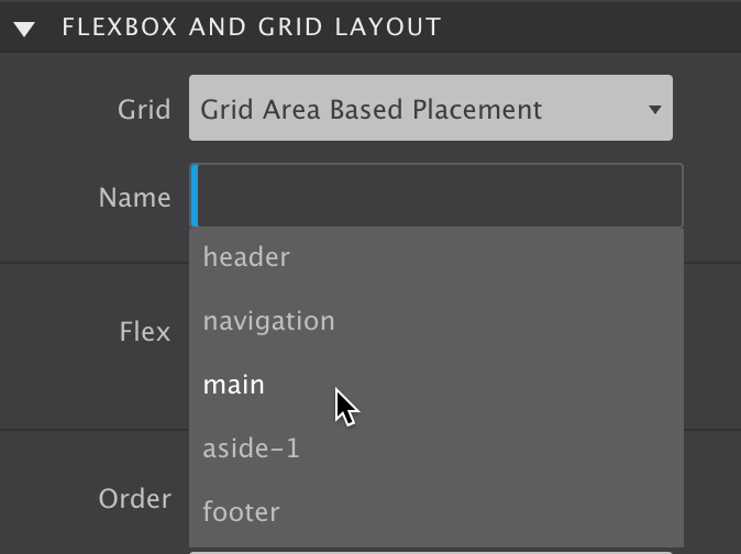
That summerizes a big part of the reasoning behind CSS Grid Builder. But there are more reasons why we developed this nifty app?
Frameworks like Bootstrap (4 alpha) and Foundation recently added a flex-grid to their code base. We think that's the wrong approach — flexbox was not made to serve as a page layout system. Flexbox was created to manage the layout for smaller page sections, and as such should be used in conjuntion with CSS Grid.
Now we do understand part of their thinking: browser support for CSS Grid is currently not as high as for flexbox. However, it has been growing way faster than support for flexbox ever did, and we expect global support to be close to flexbox in a matter of months.
That's what makes this app experimental though — you probably don't want to create production web site using CSS Grid (although this site is), unless you want to be cutting edge or mainly target people with modern, updated, browsers.
CSS Grid Builder it is great for prototyping responsive designs though. Changing layouts at breakpoints is blazing fast (as soon as you get the hang of it). And instead of multiple static comps, you will be able to present a single naturally flowing design.
At any rate, this app and tutorial will help you learn and prepare for the layout technique of the future. You can still use Bootstrap and Foundation, and see how to feels with CSS Grid for layout design.
Ready to master the grid? Enter you details above and we will send you an email with download links for both Windows and macOS. Don't worry, it's instant!
Both the app and this guide are works on progress. By signing up we will keep you in the loop with the latest developments and freshest updates. Enjoy!
