
Lorem ipsum dolor sit amet, consectetur adipiscing elit. Maecenas et metus.

Ever since the design profession came to the web world — when websites went beyond linked text documents — layout creation has felt limited and cumbersome. Starting with (nested) HTML tables, many hacks have come and gone to deal with the layout problem.
CSS Grid is the final answer to all layout hacks and (most) inconveniences. Defined as a two-dimensional system for placing elements, it is the very first layout method that truly separates content from layout configuration.
This is a big, big thing. Using 'grid' for layout is the hottest new design technique that has come to the web in years. And it is coming fast. Over the last few months the browser suppliers have been scrambling to announce (future) support for the specification and getting it implemented. Firefox has been especially on the front lines, adding cool tools such as the Grid Inspector. At this moment, august 2017, all common browser support CSS Grid...except for Microsoft Edge.
The good news is that the next version of Edge will ship with good support. We have been testing with the Insider edition, version 16, and are overall pretty satisfied with how well everything grid related renders.
The resources & news section is still a work in progress, so before we continue let's say a big thanks to Rachel Andrew and Manuel Rego Casasnovas right here. In addition to the offical spec and the always awesome MDN, Manuel's write ups have helped toget a good grasp on element placement in a grid layout. Rachel's numerous grid examples and articles have been a big help. A full list of resources and references consulted for for creating this guide and developing the CSS Grid Builder app will follow soon. Now, about this guide...
In the introduction of this guide we will briefly go over the interesting history of layout methods for websites. This will help you build a solid understanding of the advantages of using CSS Grid — the 'why' — for layout management.
Following that we will look into some of the basic technicalities and see how CSS Grid works using some demos with code examples. Here we will quickly enter into a major conceptual difference between CSS Grid and the older layout methods: entirely structured without HTML the CSS Grid is invisible by itself.
The Grid only becomes visible through the elements laid onto it. Not to worry, this is exactly what the elements placed into the grid containers in the various examples will make clear! The demo section also includes the so called 'Holy Grail Layout'. A basic understanding of CSS Grid is already enough to build these types of advanced layouts — how cool is that!?
With an understanding of the basic techniques we will be ready for the most exciting part, building real life designs that otherwise would be horrendously difficult to create without this cool new technology. Newspaper or magazine type of layouts that are device-agnostic are a good example.
Combined with CSS Shapes there are even more possibilities, but we'll save that for another guide. Now, before we start talking about historic layout hacks and grid powers, let's get acquainted with these two friendly folks.
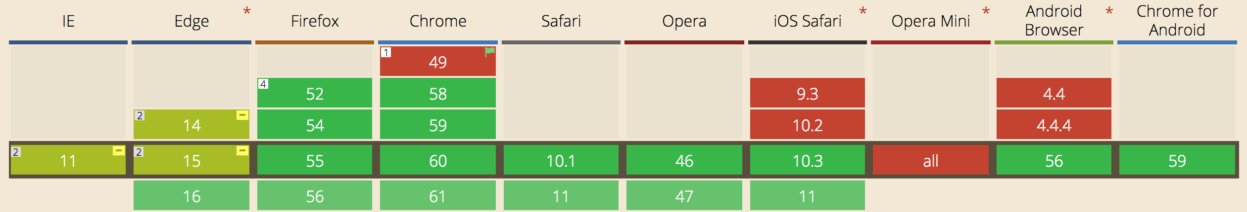
Better make sure you are using a green browser (version) before taking on this guide! Latest stats can be seen on caniuse.com.

Rumor goes that it is not even his real name! Which he only found out when he got his first passport at the age of 12....
Not (too much) disturbed by that little fact, Bob found a passion for technology, writing and creating 'cool stuff'. People around him describe him as a 'pragmatic tennis-playing geek' with a weird sense of humor...which his wife and kids will quickly contest too.
Although Bob has been soaking up American culture since 2007, his accent still gives away that he's a Dutchman. As the COO of CoffeeCup Software, he and his team launched a series of digital design apps that do NOT generate bloated code. Crafted from a crazy pizza combination of skills and technologies, these apps are used by thousands of designers, business owners and large companies such as PayPal, Mens Warehouse and Opentable to create responsive sites and (email) newsletters.
Bob has been writing about and creating on the web even before he joined CoffeeCup — the creators of the first HTML Editor and inventors of great responsive web apps. He also speaks about his mixed experiences and emerging technologies at hip conferences.
He hit off his career at Heineken. After he got tired of starting to drink beer at 4pm every work day he became a VC for 8 years, mounted his consultancy company and did all types of interesting stuff that he does not want to bore you with. His current endeavor is to develop an intuitive theme and site design app for Content Management Systems...starting with Wordpress.
Bob also worked on... The Grid Editor !
HTML, as any markup language, was created to describe and add meaning to content. A semantic language, initially created to annotate text elements and format them accordingly, but not to style them.

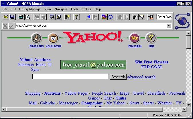
The Mosaic browser was the first to add support for inline graphical elements which was later added to the official HTML specification.
Add images and people eat it up. The popularity of the web was growing rapidly, creating an opportunity for 'overview pages' and search engines to help people navigate the web. The trend to start creating more intuitive visitor experiences had begun!
At that time Grids were not totally uncommon in web design — in the old Yahoo design some elements line up, but that is about it. There is no grid based placement, instead you will see the (now frowned upon) horizontal scroll bar in the next image!
With the increased popularity, people started seeking for ways to extend the look and feel of web pages; to extend them beyond the simple text documents with more control over the placement of elements than margins and paddings.
HTML tables, introduced in the specification around the same time as images, were being quickly used to control the flow and positioning of elements on the page. However, this means presentational data — the table structure — is mixed in with the content.
Since tables were intended to be used for holding tabular data, not for the positioning of elements, this constituted the first major layout hack.
The use of tables for layout reduced the accessibility of the design, made sites more difficult to maintain, especially when nested tables were used to create the desired layout structure. Because of these and several other shortcomings, people started adopting CSS based methods when browser support increased. This shift from using tables to the conceptually better approach of separating layout and presentation imposed a significant challenge for many.
These challenges, as well as the desire to create grid-based designs which people from the print world had been successfully using for decades, led to the first grid frameworks. At its core these frameworks used a predefined HTML and CSS structure to create rows with nested columns.
In this approach there is a master container, a <div>, that sets a (fixed) width for the page. For example 960px, which can easily be divided in multiple columns and fits within the common 1024px viewport during this pre-mobile era. Using some math that width is chopped up into left floating divs (columns) of equal widths and a (10px) gutter between them. Then specific grid number classes are created in the CSS and placed on the divs specifying how much width a column wrapper takes up.
For example, in a 12 column system with 20px gutters a .grid_1 class would make the div 60px wide, and a .grid_2 class would create a container of 140px (2 times 60px plus 20px for the gutter). Depending on the framework or settings, each row would consist of up to 8, 12, 16 or sometimes 24 columns. The actual content — images, text elements — was then placed in these columns (divs).
This, of course, still mixes content with presentational markup. But it worked and we were just getting used to it when, driven by the mobile revolution, things got worse. A lot worse....
Often things have to get worse before they can get better. For many the requirements imposed by the mobile viewers were mind-boggling. People are simply used to think in fixed, predefined, dimensions because that is the world we live in. Everything; from phones, magazines, car seats to paintings is designed or created in a specific unchangeable size.
Graphics programs like Photoshop, now about 30 years old and originally developed for print based design, brought the habit of using fixed pixel dimensions to the Web. Before a design can be started, a specific fixed canvas size must be defined.
But mobile phones, phablets, tablets, laptops, desktops, second screens, televisions screens — they all come in different sizes. Yet they are all used to browse the same web, visit the same sites, fill out the same (web) forms, view the same pictures and buy things. So this fixed pixel grid did not work anymore, a website had to be designed for an unknown display size.
In the early days of device agnostic design I compared a responsive site with a Harry Potter bus — both automagically flex and grow to fit the available width. In hindsight, the concept is not even that difficult. First pixel widths had to be replaced with percentages to make the layout flexible. But you can squish only this far until — with text wrapping and so on at some point everything becomes unreadable. So the magical media queries were used to redefine the layout a few times at so called ‘breakpoints’.
But, creating these sites requires doing a lot of calculations, way more code than before, even more testing, and can get hairy pretty quickly. A new series of responsive frameworks emerged, with Bootstrap emerging as the most popular choice. Another solid framework, and my personal preference, is Foundation.
If you are interested in working with these frameworks in a real-time visual design environment, you should check out Bootstrap Builder and Foundation Framer, two solid apps I helped create.
The advantage of working with these frameworks is that the calculations and structure are baked in, and that all this is well tested among browsers and devices. There are additional bonuses, such as predefined element styles and scripts for adding interactions. But, there are also drawbacks.
The first drawback is the heavily mixing of presentational data with content, even more so than before. Not only is a whole series of nested <div>'s needed to manage the layout, these <div>'s also require a bunch of classes, one for every width change, only for layout purposes. The layout style sheets are equally heavy with layout related styles, whether used in that particular design or not.
The second drawback is that these frameworks are relatively rigid. Modifying the default layout and design rules required a significant learning curve. Instead of designing based upon intent and from the content out, people started adjusting their content and message to typical templates.

Source: All websites look the same.
I believe one of the 1st people to write about this and come up with the abstraction here was Dave Ellis, a Leeds based web designer. Other, more famous, designers have been ranting and writing about this as well. Brad Frost, for example, wrote an excellent piece labeled, trouble in framework paradise. CSS Grid is totally different, but will it change this? I think it will, let's get into it!
As mentioned in the intro section, Grid Layout is entirely created in CSS, without any HTML. This allows us to fully focus on the natural content order, and visually place the elements independent of their position in the HTML. On smaller (or wider) screen the elements can be easily replaced if beneficial for the visual presentation.
Setting up a CSS Grid is remarkably easy. Simply declare display: grid; on any container, specify the columns and/or rows with some CSS like grid-template-columns: auto auto; and your initial grid is ready to be used!
These two little pieces of code do a lot of work: they create the grid parent (the container) with two auto-width columns, make the elements inside of that container (the children) grid items and place the items automatically on the created grid. How cool is that!
This immediately touches upon a number of the big advantages of CSS Grid. The amount of CSS is really minimal — especially when compared to the code used in the responsive grid frameworks — and very intuitive to use. As soon as you get the hang of it that is — the specification is extensive and offers a lot of power. But, as with any new powerful tool or technique, requires some studying and practice. And that is exactly what this guide is for!
Another advantage is that Grid does not require a whole slew of containers and classes just for layout purposes. In fact, it is the first time in the history of the web that presentation and content are truly separated.
Grid can be defined for an entire page, for page areas or small UI elements. Grids can be nested as well; a grid parent can have children that on their own can also act as a grid parent for their children.
Let's get started with some demos to build a solid understanding of this exciting new technology...and that's not a simple orange block you see down below there yo!
If the above grid just looks like a big orange block with some letters to you right now, don't worry, the grid structure will appear as soon as we specify a gutter.
The HTML structure (partially) shown is pretty straightforward: there is one container which includes 6 other containers. To distinguish these containers, each of them contains a <h1> element with a different letter, from A to F.
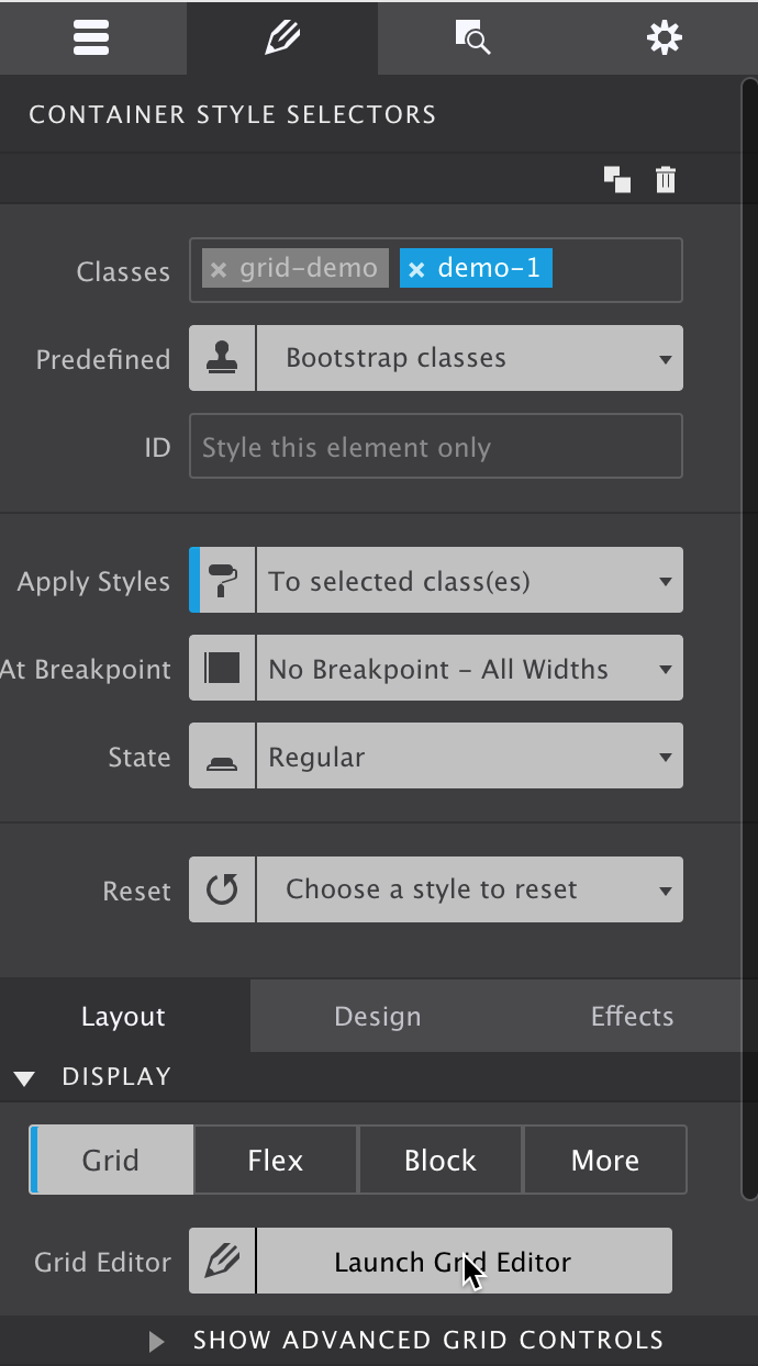
The first (outer most) container, the <div> with classes .grid-demo and .demo-1, is made a Grid parent by applying display: grid; in the CSS. Then, on the same container, two grid columns are created for small screens and three columns for wider screens through the .demo-1 selector class. As can be seen in the CSS code box above, using the auto value twice creates two columns, and writing it out it three times sets up the three column structure.
If you are trying to replicate this in CSS Grid Builder, the screenshot below shows what the Design pane indicates with the grid container selected.
If the 'Launch Grid Editor' button is clicked the grid can be specified. When opened initially there might be a bunch of rows, one for each element. They are automatically created by the browser. For our setup, simply remove all the rows by selecting them and clicking the delete button (X). Then select the column. At this stage we are not making any changes to the column settings, we are simply adding a new one with the same auto (width) value. You will find that the Duplicate buttons can be of great help here. The next image shows the setup below the first breakpoint.
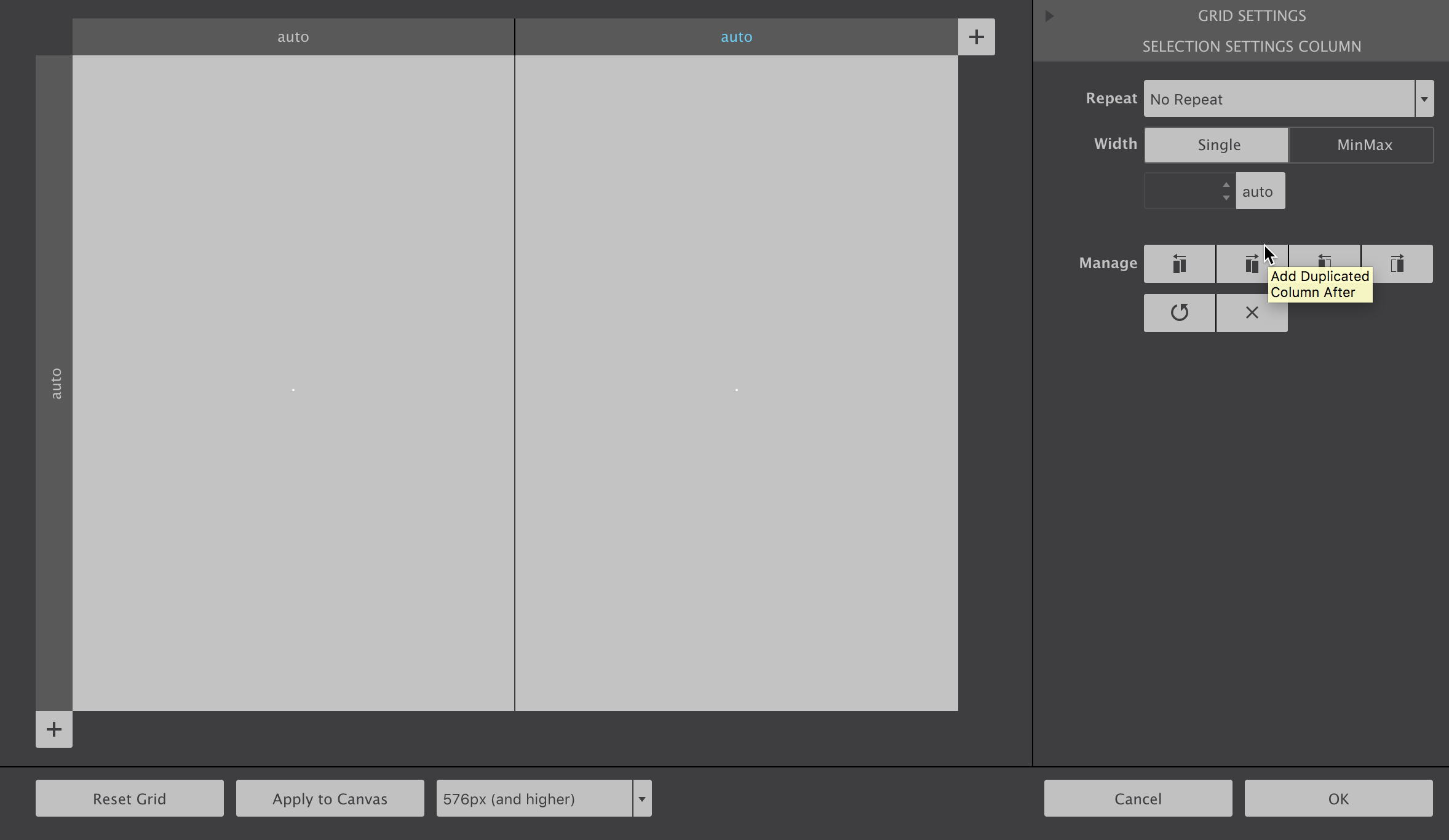
To create the three column structure at the next breakpoint simply move the viewport slider past it, or toggle the breakpoint dropdown in the Grid Editor and duplicate one more row.
The auto value means that the width column is automatically calculated by the browser; it will scale with the amount of content. Specific column (and row) sizes can also be defined, we will came to to this later.
That little bit of CSS code automatically places the Grid children, the six <div>'s with the orange background, in a two or three column structure as seen in the example above. All without setting up a complex HTML structure of rows and columns — by simply making the parent <div> a grid-container the six containers become grid-items and are positioned according to the grid rules of parent.
Speaking about rows, you might be surprised that no single row has been defined. Yet, the items cleary seem positioned that way! These rows are generated, where needed, by the Grid. Invisible, smart enough to create rows...feeling like the Matrix already? It's not that exactly, but CSS Grid is very flexible and helpful — we will come back to the implicit grid towards the end of this document.
Clearly the h1 elements could have been placed in the grid directly. However, the containers will come really handy when I explain the explicit placement of grid-items later in this tutorial.
The cool thing about the CSS Grid is that because it is CSS (duh!) it can be easily redefined at any breakpoint. In the above example the grid is changed to take advantage of the increased width at (above) the 476px breakpoint — for screens with a minimal width of 476px three columns have been specified. There the grid-items are auto-placed in the new structure.
Grid-items are automatically placed in empty grid cells according to their order in the HTML. The auto placement intelligence of CSS Grid is a great help. We will talk about the placement of items in more detail later in this tutorial. First, let's add some grid gutter!
Bye bye orange block — hello grid structure! A gutter can be inserted between grid columns and / or grid rows with the grid-gap property.
Form small screens this is 2px, both between the columns and rows. For larger screens, above 992px, this is increased to 8px.
Being able to define an explicit gutter between the elements is one of the big advantages over flexbox or float-based layout methods. As can be seen in the code box above, just two simple lines of CSS on the grid parent (container) are needed to create a consistent space between the grid items.
A very different approach compared to the older methods where you had to specify a space (margin) on the element. Which would come with some problems such as unwanted space at the edges of the of the grid. This space then had to be removed on that specific element...but when the elements wrap at smaller screens a different element would sit at the end...creating a 'chasing space' type of nightmare.
Flexbox has the 'space between' property but this space varies with the available display width and does not create a consistent gutter.
Now we can control the gutter, let's move on to creating columns and rows of different sizes.
A grid track is either a full row, or a column: both A - C and B - E are examples of tracks in the grid above.
The size (height or width) of a track can be defined in a number of different units. We started the tutorial by not specifying a specific width for the columns, having them default to auto. In this scenario the browser will automatically size them based upon their contents, a column with more content gets more of the available display space. Since all grid items have the exact same amount of content, the space was divided equally.
In this demo the second row gets a (fixed) pixel height of 100px. This makes the middle row (or bottom row on wider screens) taller than the other row(s) which still take up the same space as before.
Above the second (476px) breakpoint, the second column gets the same 100px value. The two other columns automatically take up the rest of the space, making them wider than the middle one.
The track sizes can be defined in the same units — pixels (px), percentages (%) and viewport sizes (vh, vw) — that have already been available for other CSS properties such as margin and padding. However, there is also a new unit kid on the grid that is creating quite some excitement!
The new fr unit represents a fraction of the remaining free space in the grid container. The word 'remaining' is an important one here — first all the specifically defined space such as 100px or 20% is allocated. Then, if any space remains, it will go to the tracks using a fr unit.
This space is proportionally divided between the 'fr tracks' according to the number of fr's. In the above example the first column gets 1 out of the available 4 parts on small screens. At screens wider than 476px we again use a 3 column grid, making both the 1st and second column 25% wide (1 out of 4) and the third column 50% (2 out of 4).
All types of cool stuff can be done using the 1fr unit as we will see later in this tutorial. For now the takeaway is that this new unit is giving us an easier way to create advanced responsive layouts, without entering in complex calculations.
Up to now we have only been working with the grid parent, leaving the items to do their automatic thing. But, the placement of each grid item can be controlled in exact detail. Next let's see how that works.
As we have seen above, as soon as a parent container is set up to display: grid; the child elements inside of it become grid-items. That means that they flow automatically into the cells of the grid, starting with the first row and according to their position in the source.
The first element in the code gets the first cell, the second element the next available cell in the row. When the row is filled, the same is repeated for the next row, until all items are positioned. If there are more items than cells, implicit rows are created using the same column structure until all items are placed. Especially when using a Content Management System such as Wordpress where content is created outside of the design, this can come in really handy.
The default positioning behaviour can be influenced through various properties for the grid container. We will come back to these more advanced grid configurations later, first let's see what can be done with the grid-items directly.
Grid-items can be specifically placed on any section of the grid, again with a minimum of simple instructions. In the example below the visual order of of the boxes has been changed — now Box D is placed in the first grid-cell, Box C sits in the second and so on. Please note that the HTML code, the order of the containers in the HTML, is still exactly the same as in the 'setting up the grid' example. In the HTML Box A comes before Box B which comes before Box C etc.
In this demo the items are placed in different cells using the 'grid lines' method. The CSS that determines where the boxes are placed has been included in the containers. How this exactly works is explained in detail below.
First, begin with the grid setup in the code box below the demo container. Since the items in this example don't have the same amount of content, and I don't want to run the risk of some columns being wider than others, I am not using the 'auto' values. Instead, I am defining equal width columns using the fr unit: each column gets 1 equal part of the available space.
For the rows, you will see how they are automatically filled — grid items with less content still take up the same height as the adjacent item. This is the default convenient behavior but, as almost anything with CSS Grid, that can be changed.
Now back to the placement of the items. Except for box A and F, each of the grid items shows a bit of code that controls its placement on the grid lines. Grid lines are horizontal and vertical lines that form the basis of the grid structure. They can be used to precisely position items on the grid. Whereas the boxes previously were automatically placed according to their order in the markup — their DOM order — in the demo above each box is explicitly positioned between grid lines.
Using the .box-b class selector, the B box is now placed in the first column and second row of the grid on small screens. This is done by specifying the starting and end lines for both the horizontal (grid-column-start: 1;) and vertical (grid-row-start: 2;) placement. At larger widths — for screens with a minimal width of 476px — it is positioned back in the first row (between row line 1 and 2) but in the third column (between column line 3 and 4).
The other boxes follow a similar pattern, the inserted code sections for each element show the exact code that determines their placement. There are a few things to note.
Boxes D and C have not been repositioned at the media query, they remain in the same position independent of screen-width. Also, Box A and F have not been positioned at all. They automatically flow to the first available spot — the first grid-cell that is not taken up by any of the other grid-items. Box A sits higher in the DOM Tree than Box F, so that item is placed first.
On small screens Box E is not placed either, so there Box A also takes the spot before E.
As briefly mentioned before, CSS Grid makes it easy to visually rearrange elements independent of their source order. However, this does not change the order in which content is being read by a screenreader or perceived by a search engine. They will keep following the HTML code — reordering is for visual (design) purposes only!
In the demo, each of the boxes only takes up a single cell of the grid. In that case the end position does not need to be specified. The default value is auto which makes them take up a single cell. The code area in Box C shows this.
Indeed that indicates that the boxes — grid items — can span multiple tracks (columns or rows). Positions can also be left open and grid-items can overlap —CSS Grid is a powerful beast allowing for all types of creative layouts. We will look at a few of those designs in just a bit, for now let's get some more placement experience in.
The CSS Grid syntax is extensive and very flexible — there are a variety of placement options, while the same result can be achieved in a number of ways. Although the concepts behind CSS Grid are solid and clear, this is what makes learning Grid a bit involved. The above example summarizes a few of the most important placement use cases, let's briefly discuss them.
For this demo, the Grid setup has been modified from the intial example. Now also on small screens there are 3 columns — using the 1fr value each column takes up an equal portion of the width. I also created a total of 5 rows. All the rows use auto(matic) height sizing — they are flexing with the content, except for the middle row. This row has a fixed pixel height of 50px. No changes are made at any breakpoints.
The detail of this grid setup are shown in the 'corresponding code' box in the example section. To clearly illustrate the grid-lines concept and show the rows, I added an image with overlay below. The grid-lines bordering each of the 5 rows are numbered 1 to 6 and white line has been drawn next to them. With the right visual in mind, let's see what's up with the grid items!
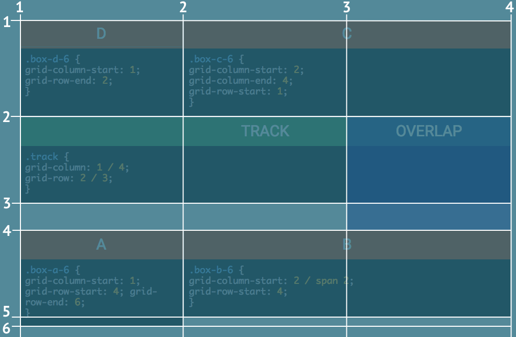
Starting with box D — which uses a new selector box-d-6 as to not upset the previous example — the row placement is done differently. The column-start definition is as we saw before, the item is placed as of line 1 and fills 1 cell by default. However, for the row, no start position has been specified. The row-end definition takes care of that though; ending the placement of the item at row 2 and automatically going back to fill the one cell before that.
Box C has something new to teach us as well. Grid items can be instructed to take up multiple cells by increasing the end value. Starting at line 2 and ending at line 4, this box spans columns 2 and 3.
Jumping to box B you will see that this grid item also uses column 2 and 3. Here however only the start is specified. Then the span keyword is used to make the box stretch 2 columns, up to line 4. This box is placed within row 4 — starting at line 4 and automatically spanning a single grid-line up to line 5.
Please note that this makes Box B slightly less tall than Box A . This box also starts at line 4 but ends at line 6, spanning 1 additional row.
There are also two new kids on the grid! A green box that illustrates the 'track' concept, and a blue box showing that elements can also be layered and overlapped. As mentioned before, a grid track is either a column or a row from the start to the end. The green track box is placed on the second row and shows the 'shorthand' syntax for its placement —column line 1 to 4 and row line 2 to 3 — in the embedded code box.
The blue overlap box is placed in the last column. For vertical placement it uses row 2 and 3 — starting at line 2 and ending at row line 4. Since this element was added after the green track box in the source order it sits on top of that box. The layering order — 'depth' — can be controlled using the z-index.The item with the higher value will be placed above, and potentiall cover, an item with a lower value.
The third row — which has a fixed height of 50px — shows that cells can be left unused. The Overlap box uses the third column cell, but the first 2 cells are 'empty'. Since there is no physical container like in an HTML grid — the CSS Grid creates 'virtual' space — 'empty' is a bit of a strange word here, but is does illustrate the concept. Please note that, if no elements are placed within a track and no size is specified, it will collapse to a 0px track. Since Box A uses row 5 this is not happening there, but it is what would happen if we would add a row 6.
Pwewies, that's a lot of layout power right there! Yet, there are more exciting things to come...let's continue with an alternative way of placing items, using grid area names — yay!
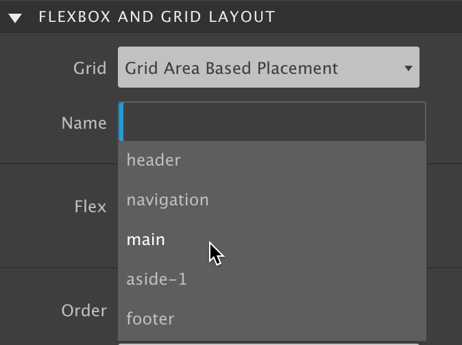
You can give grid cells a name and define areas by giving adjacent cells the same name. Taking this approach you are basically creating a semantic map of your design. And it gets even better, on its turm the grid-items can be positioned by simply entering the corresponding area name like so: grid-area: area_name;. Very powerful and intuitive, let's dig into this!
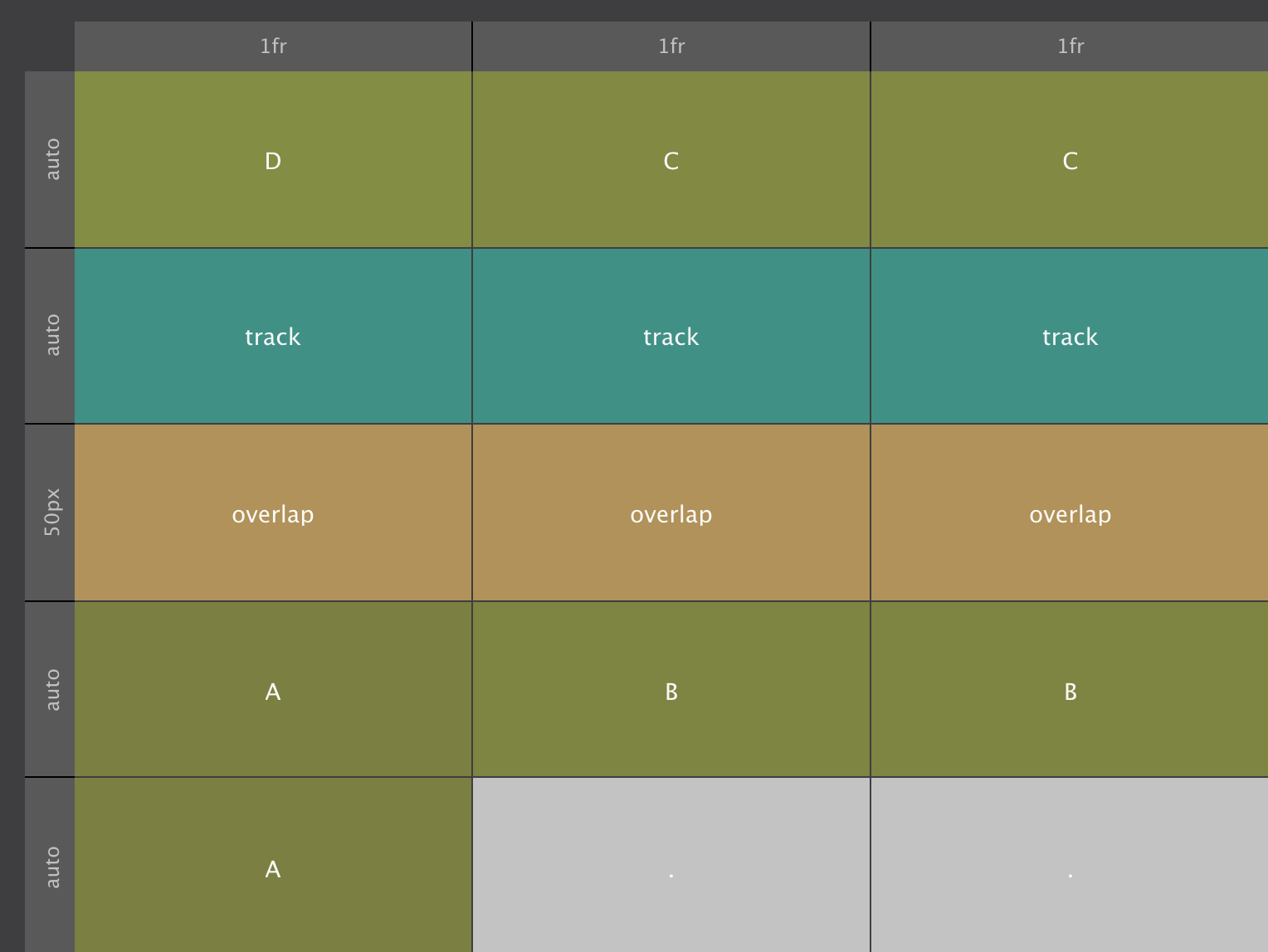
To create the named grid areas I added the class .grid-areas to the grid container (parent) element. For that selector 6 grid-areas have been specified, one for each element.
The cells are named on a per row basis — for each row, from left to right, a name is entered between the quotes in the code section above. The first cell in the first row is defined as area D, the next two cells together create are C. The entire second row is defined as the 'track' area. An abstraction of of the map — and the way it would be seen in the CSS Grid Builder app — would look as follows:
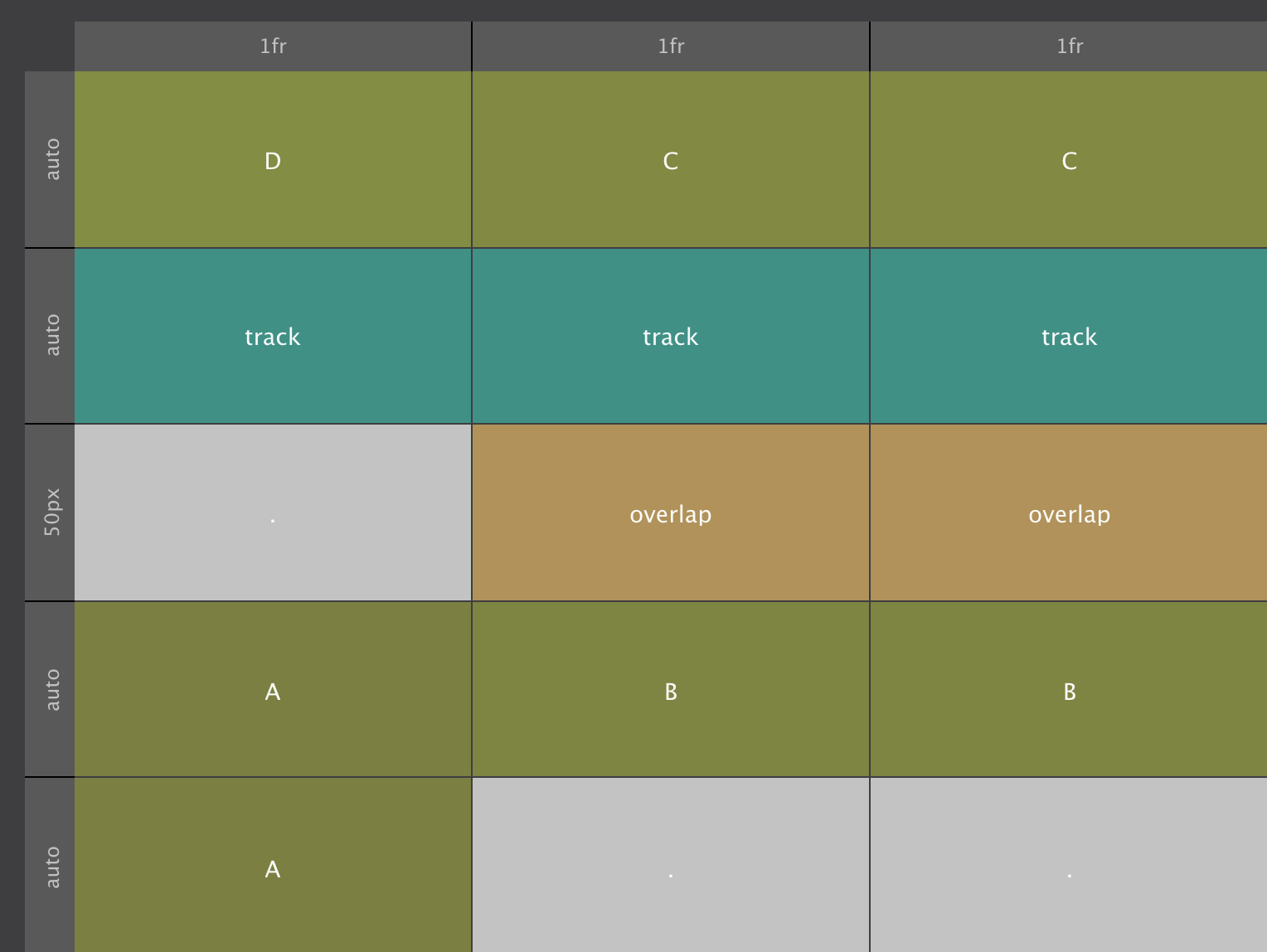
These grid-areas can be changed at breakpoints. At screens wider than 476px the overlap area does not start at the first cell, but in the second, leaving the first cell empty. When no name is specified, a period is used, they signify empty cells. There the map looks like this:
With the named areas defined, placing the items is as easy as pie. Box D, for example, finds its spot by simply telling it to go to grid-area: D; The other items are placed in a similar way, the code can be seen below each of the items in the example.
One thing to notice is that there is almost no height difference between Box A and Box B this time. This is explained by the content — since the amount of content is the same, thelast row collapses to zero pixels. However, it will still span over the gutter, explaining the 2px height difference.
This method of placing the items can be combined with line based placement. For example, the purple / blue container could still be placed in grid-column: 3; and grid-row: 2 / 4; to create the overlap from the previous example.
Clearly using letters for grid-areas is not the most intuitive way of naming them. Using more semantic names an intuitive map of the design can be created.
In this example, common section names like 'Navigation' and 'Footer' have been used to denote the grid areas. Remember, the CSS Grid does not physically exist — what you see in the above example are containers with a text element inside that are laid out using the grid.
Since I have seen many people struggle with this concept, one more analogy: think of CSS Grid as a coordinate system, a virtual reference used to specify locations. The elements, <div>'s in this case, are then mapped onto these locations. The cool thing is that repositioning them is super easy — the only you need to do is change the settings of the coordinate system.
For example, at the smallest screen size, I made all the areas stack. There is a single column taking up all available space using a single fr unit. Six rows have been defined, each with their own height settings. This creates 6 cells, each of which has been specified as a single grid area. An abstraction of this setup is visualized below.
The actual size of the different areas — the rows — is visible on the left, but not simulated in the abstraction (created by CSS Grid Builder). The height of these rows is defined through the new MinMax function. The first row — which corresponds to the header area — has a minimum height of 80px but can (automatically) grow if required by its contents. This allows for designing all types of super creative and flexible layouts. We will talk about this, and other grid configuration possibilities, in the next chapter.
All this can be traced back in the 'Corresponding CSS Code' section as well. Looking closely at the code for the grid-template-areas you will remember that they are named on a per row basis. First the header, then the navigation and so on. The start and end of a row is denoted by a single quote ( ' ).
With more than one column at widths above 476px, the same approach is followed: on a per row basis each cell is given a name like so 'header header' 'navigation navigation' and so on.
This two-column structure is visualized in the next screenshot. As more horizontal space comes available, for screens wider than 476px, I am adding a column and rearranging the areas. First, instead of stacking the two aside sections, I am placing them next to each other. In the CSS Grid Editor this is done by simply duplicating the columns at the 576px breakpoint. Then the grid areas in row 4 and 5 are renamed, the left cells become aside-1 and the right cells aside-2.
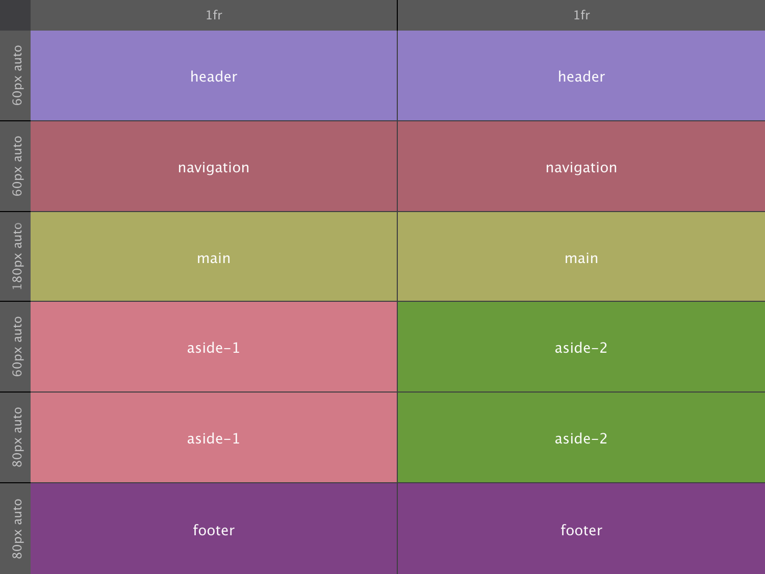
Without having to make any changes to the grid items themselves, the containers now appear placed next to each other. That must the smoothest layout update at a breakpoint in web design history!
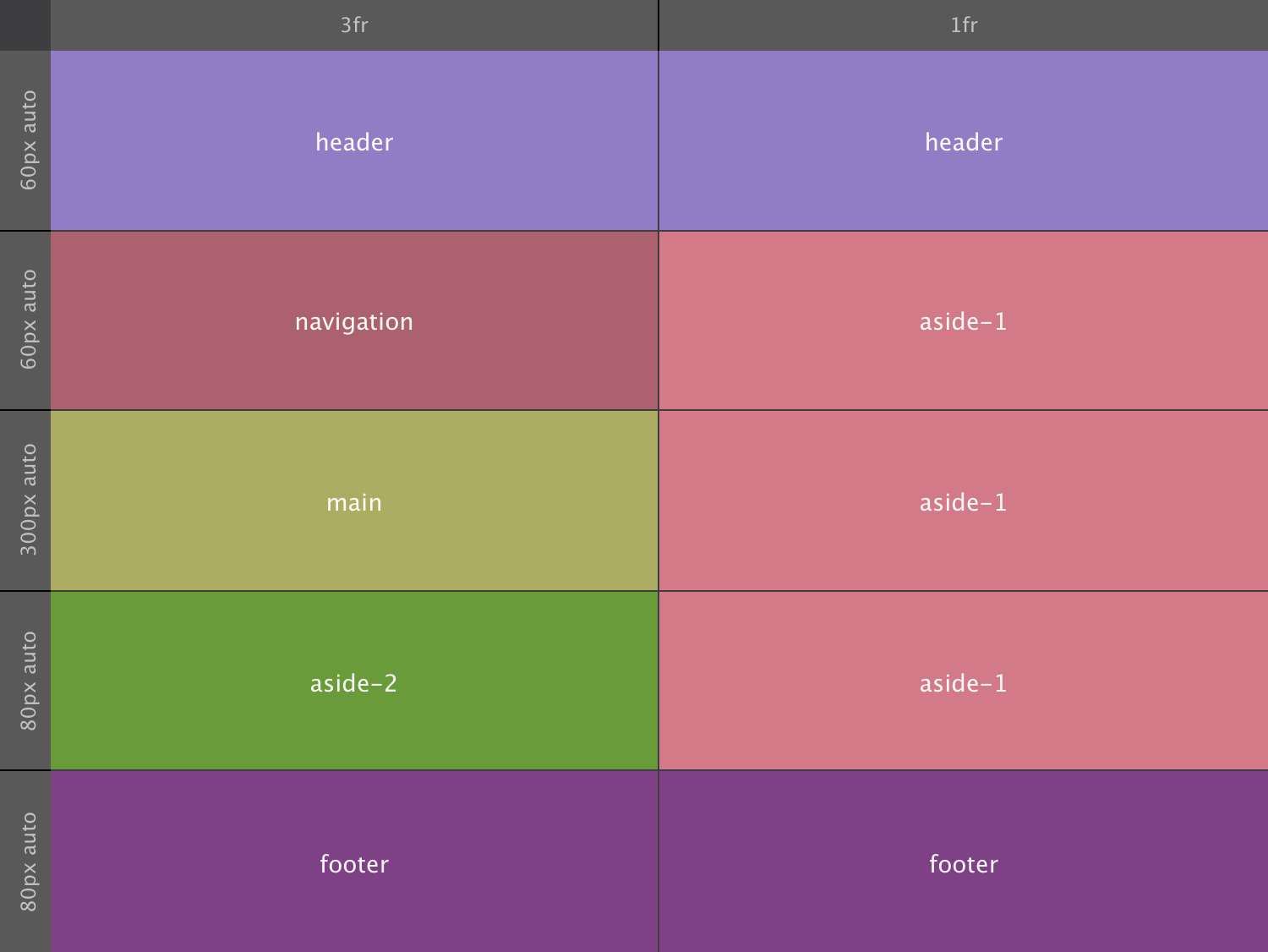
The layout is again restructured at the next breakpoint. The first column now gets a value of 3fr whereas the second column sticks with a width of 1fr. The result is that the first column takes up 3 times as much space as the second, creating an 'aside' on the right that takes up 25% (1/4) of the width.
Also, one of the rows has been removed and the size values for each of them adjusted to create the exact proportion for each of the sections that we want. Please note that these adjusted size values are not shown in the CSS Code block above. The structure is shown below, with size values for each the tracks on top or left.
The actual content is added by placing elements in each of the 'area containers'. The cool thing is that each of these area containers can be grid parent as well, allowing for the very precise and creative position of the content inside.
Adding content to a semantic grid is one of the things we will be doing in chapter 6. First we will create a slightly more advanced grid, a variation of this semantic grid, also known as 'The Holy Grail Layout'.
Layouts that previously were difficult — sometimes even hairpullingly impossible — to create, are now within easy reach. New functions such as the MinMax that we touched upon in the last example, in combination with new sizing units such as the fr offer all types of responsive layout possibilities.
Another helpful function that the observant reader might have spotted in the last CSS Code box in Chapter 4 is the Repeat function. This method allows you to define a pattern, which is repeated a certain number of times. In the previous example this was used to specify the last two grid rows by simply using repeat(2, minmax(80px, auto));.
That single piece of code creates two grid-tracks with a minimal size of 80px and allows them to automatically grow if needed by its contents. To create five of these tracks simply set the repeat value to 5.
When Repeat is used in combination with auto-fill (or auto-fit), tracks of a specific size or size range can be automatically generated as display room becomes available. This can be very helpful when responsively laying out 'unknown' content like, for example, content generated by Content Management Systems. Looking at a use case for this seems like a good idea and is what we will do later in this chapter.
To kick oft this chapter we will be taking on a layout design that historically has been a tough nut to crack, the 'Holy Grail'.
For starters let me point out that the 'Holy Grail' is not necessarily better or more effective than other site structures. The name comes from the elusive search to find a good implementation for creating this very specific layout structure. But now, with CSS Grid, it has become a piece of sweet cake!
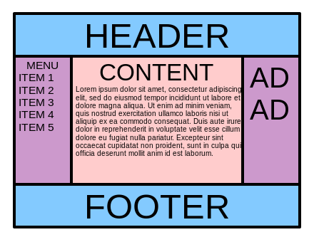
The Holy Grail Layout consists of five sections - a header, main content area with two sidebars, and a footer. There are various requirements. On small (mobile) screens all the sections need to stack, with the header on top, followed by the sidebar with the navigation, the main content area, the second sidebar and finally the footer. Yet, in the source order the main content area needs to be placed before the sidebar with navigation. This requirement stems from the common belief that search engines consider content higher up in the DOM Tree — code of the page — to be more important.
Another important requirement is that on wider screens the sidebars and main content area have the exact same height, independent of their contents. By default, containers grow and shrink depending on the amount of content, visualized below in the 'No' Holy Grail image from wikipedia.

Making elements within a section automatically stretch to the same height was achievable since the introduction of Flexbox and is now also easy to do with Grid.
Furthermore the footer should always be at the bottom of the browser viewport, even when the content doesn't fill up all the height. Finally, the main content section needs to flex — grow and shrink — within a certain range depending on the display width. The sidebars on the other hand should have fixed-widths. Many variations on this structure have been created. I included a nice tweak in the live demo of the holy grail using CSS Grid above as well. This structure is shown in the wikipedia image below.
Now let's see how I recreated this structure with CSS Grid.
Setting up the 'stacked' mobile version is nothing we have not seen before. The HTML code below gives us the handles to create the different layout areas.
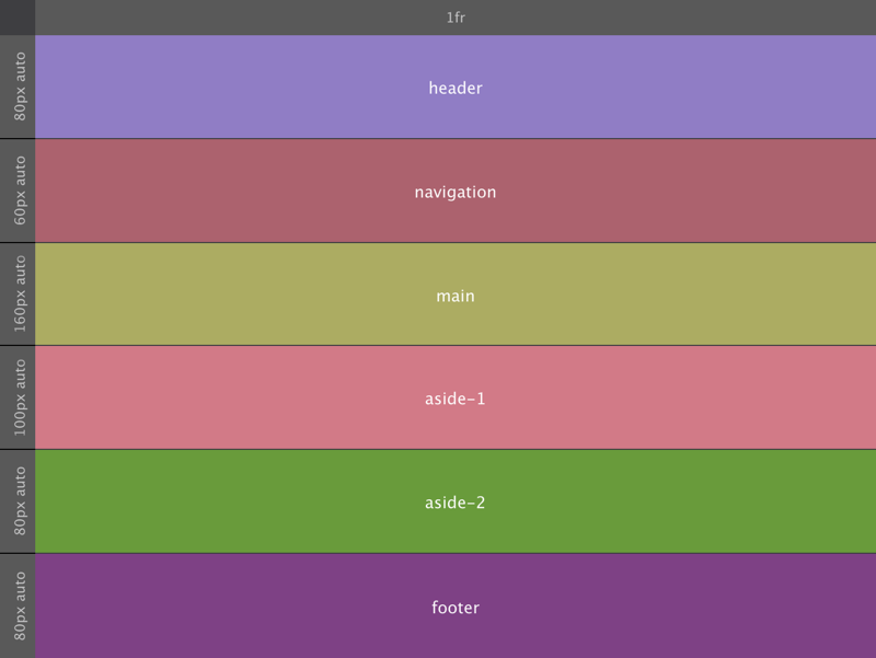
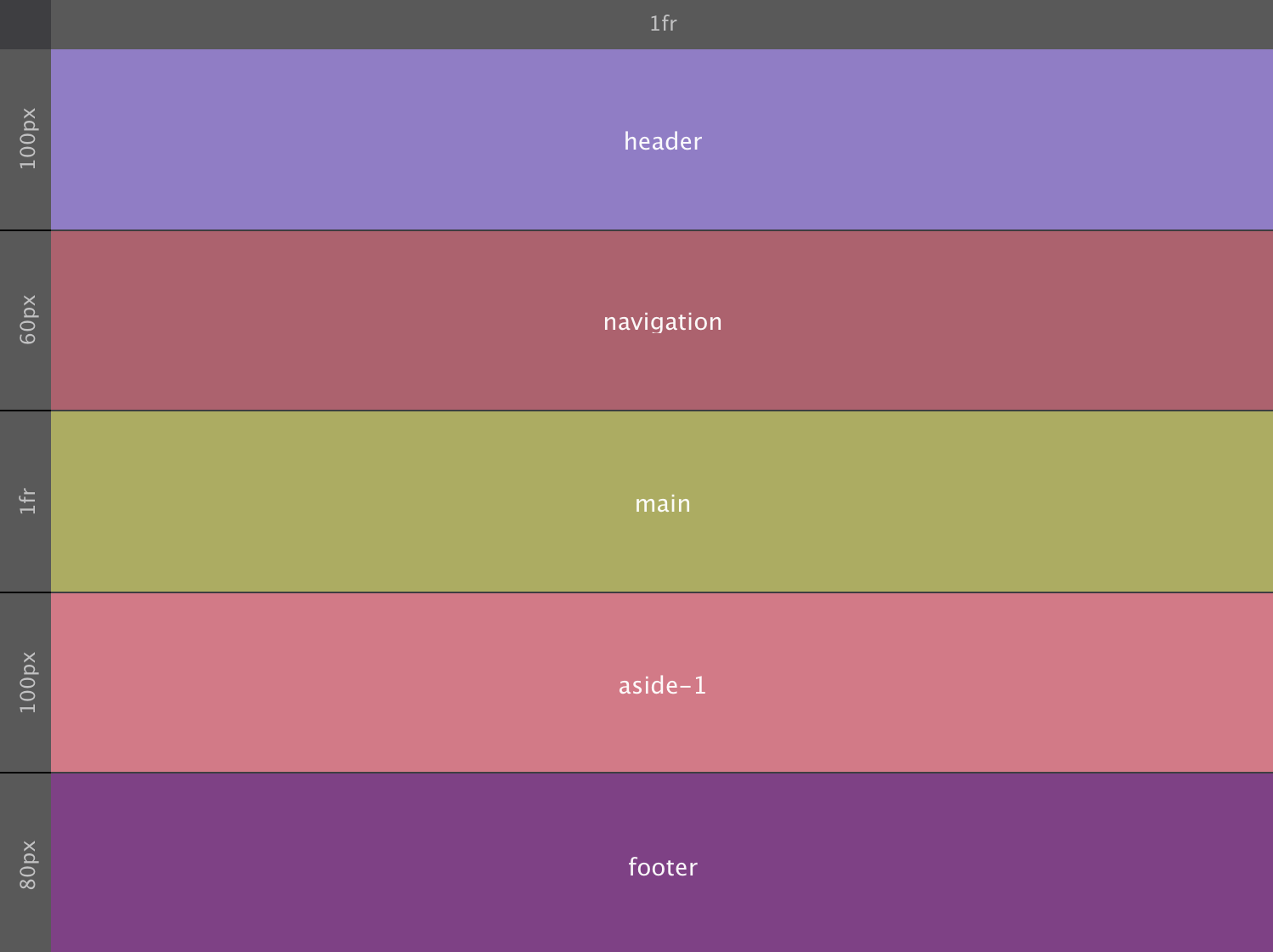
HTML CodeFor the grid we are using a single column that takes up the full width using 1fr. Then there are five rows, one for each container. The resulting five cells will be getting the intended area names such as header, main and so on.
To mimic the height of the (device) viewport, the grid container has been given a height — the specific height of 580px is a bit arbitrary but will do the job. Of that height each of the rows / areas takes up a fixed part; 100px for the header, 60px for the navigation and so on. The main content section takes up all the free space (if any). The 1fr will do that job, causing the grid to always fill the screen (container in our example) even if the content does not help to fill it up.
The grid setup for small screens would look as below. Please note that in contrast to the HTML code above, in the grid CSS main comes after navigation.
Or in code:
CSS CodeWith that the only thing left to do is to add the grid areas names to the corresponding element selectors — the different classes for each container — like so:
CSS CodeOr when done in the CSS Grid Builder app using the auto-complete dropdown:
With the initial grid setup and containers mapped to the corresponding areas making adjustments to the layout for wider screens is super easy. Simply updating the grid setting will reposition the elements, nothing, zero, nada has to be done on the elements themselves! Here is the (visual) grid configuration following the 768px breakpoint:
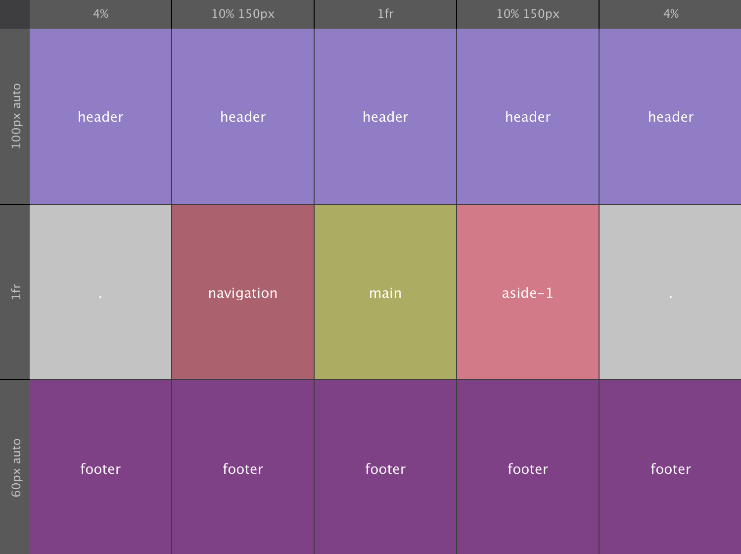
For viewports wider than 768px we switch to using 3 rows and 5 columns. Working from the inside out, with the 1fr size value both the middle row and column take up any 'left over' space. Both sidebars get 10% of the width, with a maximum of 150px.
The first and last column get 4% of the available space. Only the header and footer areas use these columns, making them stretch the full width. A nice contrast with the empty space on the left and right in the row with the sidebars and main content areas.
The effect is pulled off by leaving the left and right cells in the content row empty / without a name. If no name is given, a period ( . ) has to be used. That way no cells are skipped, creating a consistent structure for the browser to interpret. Just a slight but now easy to create enhancement to the original Holy Grail layout!
The header and footer rows take up a minimum height of 100px and 60px respectively. They can both grow if required by the content. So, at the minimum values the, height of the content area will be 420px (580 minus 160). In code the restructured layout will look as follows:
CSS Code--------With the layout map redrawn the items (containers) will automatically shift to the new area positions, taking their contents with them. Again, all without changing a single thing on the grid-items themselves — sweeeet!
Before we start adding content into the layout sections (containers), let's see how we can build a grid that will automatically generate as many track as will fit into the grid container. When we need to work with a bunch of smaller content elements within containers that automagically reposition and change sizes, this is something that I suspect could come really really handy...
Lorem ipsum dolor sit amet, consectetur adipiscing elit. Maecenas et metus.
Lorem ipsum dolor sit amet, consectetur adipiscing elit. Maecenas et metus.
We have seen it a number of times now, CSS Grid is a smart creature. It is very aware of it's children, the grid-items, and will adapt where needed. This is illustrated with the above example where placeholder content is added the holy grail layout of the previous example.
The navigation section now contains an actual menu structure. This can be created in a number of ways — many people use an <ul> element with list items. In this demo I am using a simple container with a series of button elements inside. As you can guess, this container becomes the grid-parent, turning the buttons into grid-items.
On small screens, the navigation buttons are placed next to each other, with a small gutter between them. This process continues until the 'grid' runs out of space. At that point, grid is smart enough to create a new row where the exact same pattern is repeated. To set this row apart, a row gutter (gap) is defined as well.
It still gets better. When room does become available, on wider screens for example, buttons that were placed on a lower row will move up when possible. This also means that buttons can be added or removed as needed, or as generated by a Content Management System while the structure remains intact. There will always be a well organized and systematic laid out navigation menu, no matter how wide the screen or how many buttons there might be.
Setting up this type of structure only takes a few lines of code:
CSS CodeThe heavy lifting is done by the repeat function in combination with the auto-fit and minmax keywords. As discussed at the the start of this chapter, repeat can be used define a row or columns pattern that repeats a certain number of times. When auto-fill is used instead of a numerical value, the pattern is repeated as many times as will fit in the grid container. The auto-fit keyword behaves in a very similar way, except that it will only create as many tracks as needed to place the grid-items.
The minmax function controls the size of the tracks. They will all be a minimum of 80px. If there is room available, if there are not enough grid-tems to fill the space, they can grow. In that case, the 1fr makes sure the tracks will all have the exact same size.
When the position of the navigation section changes to a small sidebar on wide screens, the buttons stack. No code changes are needed for this. Since there is simply no room for more than 1 track of 80px, new grid rows are automatically created until all items have been placed. Since these rows have not been explicitly created in the code, they are called implicit rows, generated by 'grid'. Although the columns are also auto-generated, they have been specified in code and are therefore explicit columns.
The main section uses similar techniques to place the items, especially on small screens where there is limit room for creating creative layouts. On wider screens however, we want to 'unbore' the structure and spice things up a bit.
I added a bunch of container to the Main section, and threw some random content in each of them. Then I made the Main section a grid parent to manage the placement of the containers.
On small screens the 'grid approach' on the main section is very similar to what we did with the navigation. Before the smallest breakpoint I configured a column structure where the grid items would be placed next to each other every time a new spot of 250px would be become available. This assures elements never get too small, but are also automatically laid out in a slightly more attractive manner if possible. This little piece of code grid-template-columns: repeat(auto-fill, minmax(200px, 1fr)); does the all following:
At the first breakpoint the spicing up starts. There I am changing to a two column grid, where the 1st column takes up twice as much of the space as the second column, 2fr versus 1fr basically!
To be completed...
It is content that makes the web go round.


Get the latest speakers, wearables, headphones and more.
Shop now >


More stories
More stories
Sophisticated companion robots have arrived. But we need to be very careful about how we interact with them.
Sophisticated companion robots have arrived. But we need to be very careful about how we interact with them.
Sophisticated companion robots have arrived. But we need to be very careful about how we interact with them.
Sophisticated companion robots have arrived. But we need to be very careful about how we interact with them.
Sophisticated companion robots have arrived. But we need to be very careful about how we interact with them.
Coming soon: for nav compare to flexbox, no borders are needed. Use grid gap instead. Two drawbacks, the background if the elements wrap. Plus pixel rounding error in Chrome on uneven px widths.

More coming soon...but here is a link to a (ski) magazine theme using CSS Grid and a cool fashion theme. Make sure to check them all at at different viewports. They look cool small, but are amazing above more or less 1600px!
Here we are going to align the items, unstretch them and do other fun stuff. I am also going to create extra space in the container and do some content justification magic.


