Welcome to
The CSS Grid
Liberate your layout

Layout done right
Using 'grid' for layout is the hottest new design technique that has come to the web in years. And for good reason, ever since the early days of the web world, layout creation has been cumbersome. A fact only amplified by the responsive revolution where layouts have to be adjusted depending on the available screen width. Luckily CSS Grid is the final answer to all the old layout hacks and inconveniences.
Pixel precision is back!
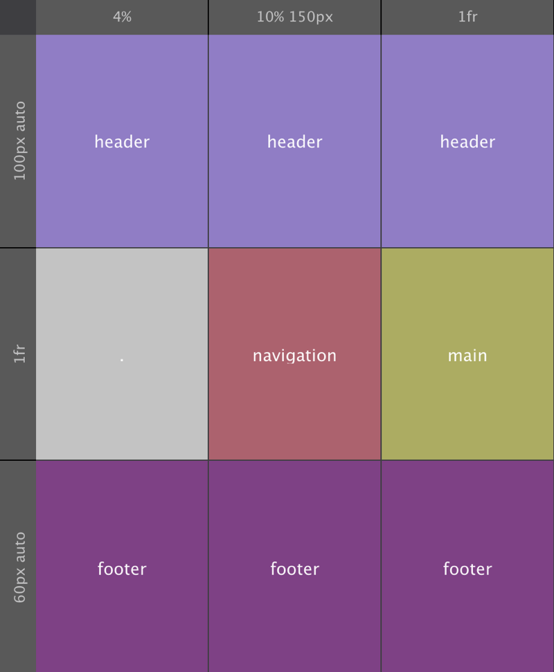
With Grid Layout, content can be placed explicitly and precisely in grid containers. These containers can also be nested — the child grid containers can be easily be arranged within their parent grid container.
Easily rearrange layouts for different screens
With media queries, the elements (and 'element containers') can be easily repositioned to accommodate for different display sizes. We made a short video showing a full-blown layout change using line-based placement. What's really cool is that the entire rearrangement you see below took me less than 10 minutes!
Get started today
The CoffeeCup team has been busy creating tools and tuts that help you get started with CSS Grid and turn you into a Grid Pro soon. They are all available on this site, go here to read more about it »
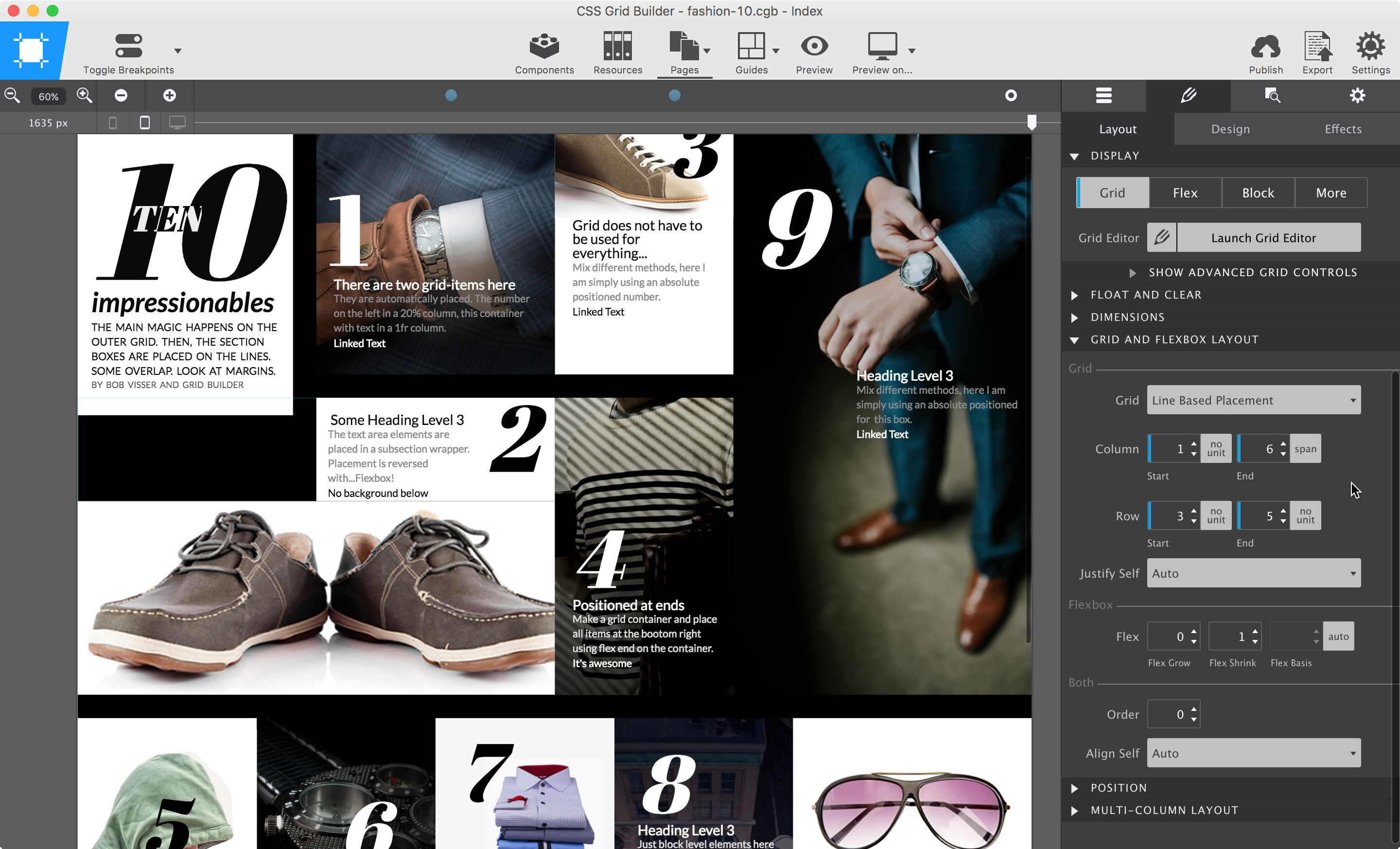
Changing the layout at a breakpoint in CSS Grid Builder.
Stuff we made to help you learn Grid
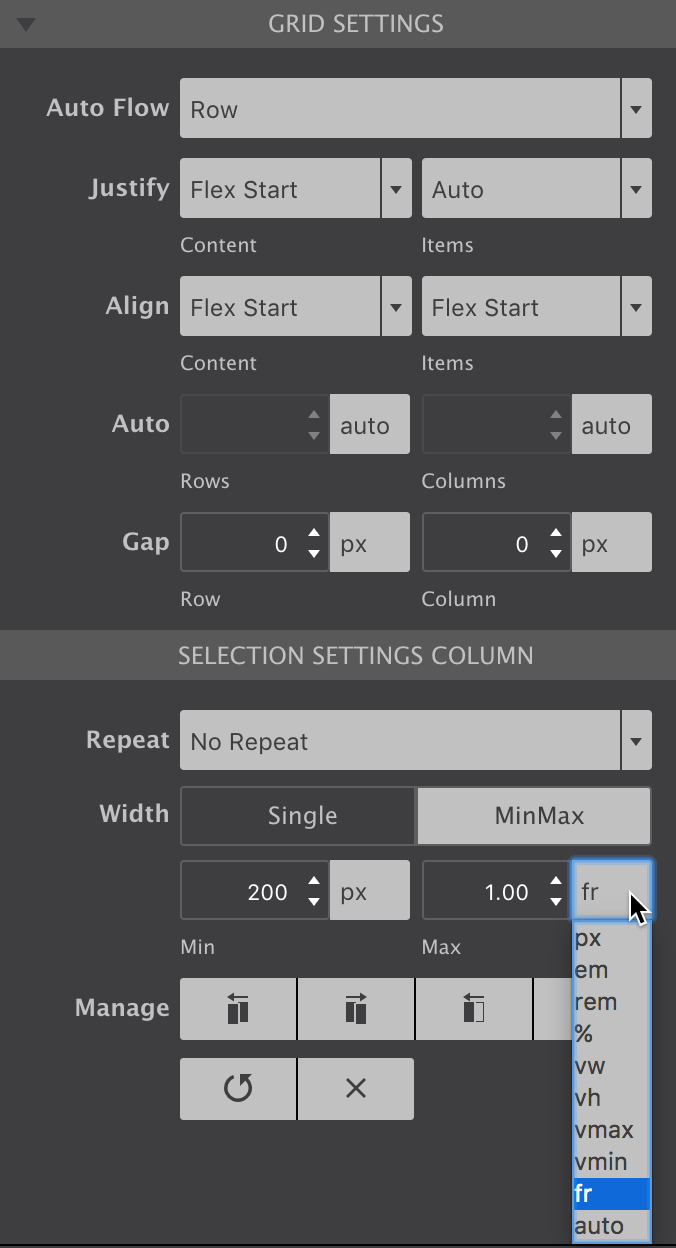
We are pumped about CSS Grid and hope so are you. To help everybody transition into this new layout technique we created a nifty app with visual grid editor that you can download for free. The app is a great learning tool, yet most powerful when used with an understanding of the technique. For this we created the CSS Grid Guide. The guide is a never ending work-in-progress that combines code theory and explanations with real-world design examples and instructive demos.
Lastly we put together themes that show some layout muscle. You will quickly see that they are very different from the regular Bootstrap based web site, yet look great on any screen. Yup, they were crafted with the CSS Grid Builder app.
Don't get me wrong here, CSS Grid can totally be used together with frameworks such as Bootstrap and Foundation. However, you might not want to use them for managing your layout... CSS Grid will do a much better job at that.
Get off the grid, make interesting stuffs
Always starting with that 12 column layout? No? 18 or 24 then maybe? Forget that too. Place the content and make it look different than aaallllll the 12 in a dozen sites that follow the exact same structure. Because....with CSS Grid you can.
(But don't be a 12-column bore.)

Sure, you gotta make things line up and all that, and with CSS Grid you can do that too. In short, absolutely adhere to the core principles of grid-based design, just don't be a total bore about it.
Time to get your grids on with CSS Grid Builder and the CSS Grid Guide!